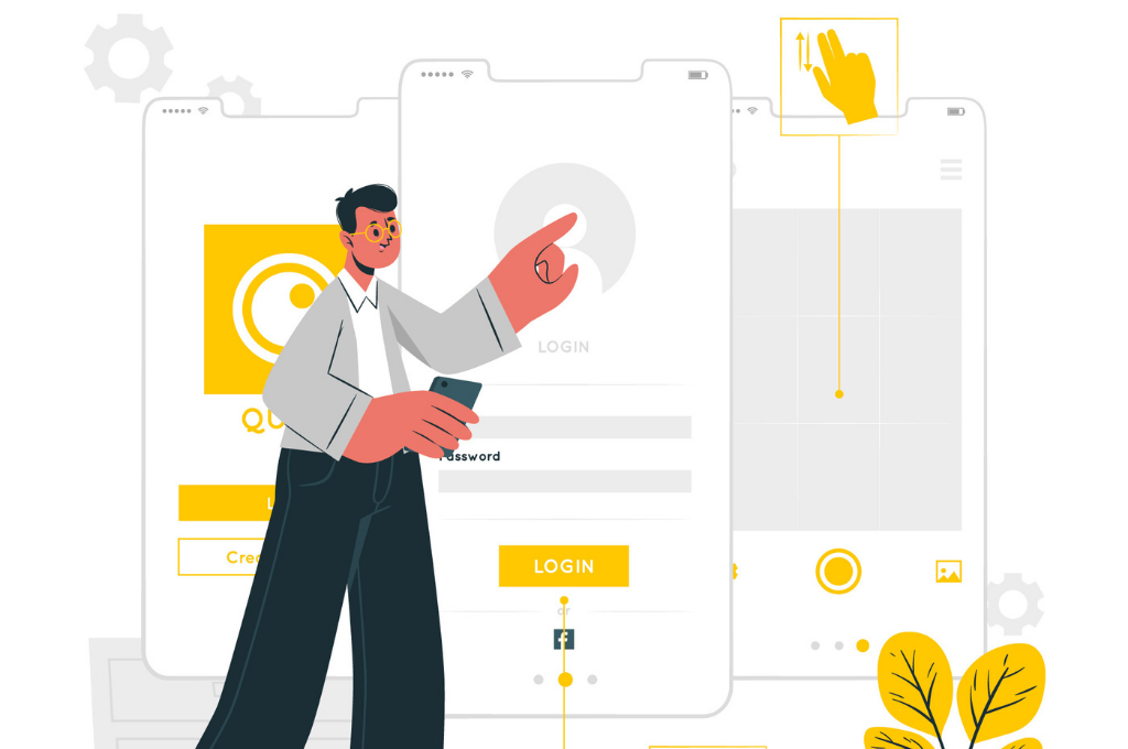
Being an end-user, you might have come across numerous micro-interactions daily without even knowing what it is.
Flipping web content (articles, Instagram stories, news, etc.) or clicking ads or sending emails, and so on. It all comes under micro-interactions. We engage in it by just performing such trivial tasks. These micro-interactions are implemented everywhere in each well-defined device, touchpoint, app, website, and feature.
The world of digital customer experience is growing enormously with every passing day, and every business type wants its users to have the best experience. When designing a product, we find multiple ways to enhance the customer experience that includes defining personas, well-structured information architecture, and researching in-depth content.
Micro-interactions help designers create something unique and out-of-the-box that thrills the target audience.
This article will help you understand micro-interactions in detail.-What are they, why are they important, and their usage.
Understanding Micro-interactions In Brief
Micro-interactions are small, crisp, and engaging animations that entice the targeted audience by giving interactive feedback.
For example: when you pull down the notification bar on your phone and tap on an app icon to open it, this is a micro-interaction. These tiny moments have been proven to make up a sizable part of the overall experience with a product for some users.
Effective micro-interactions include four elements that are the trigger, rules, feedback, loops, and modes.
-
The trigger initiates interactions with a user. It should be something visible that a user can easily interact with.
-
Rules are basically the flow of micro-interactions, something happens once they’re triggered.
-
Feedback is the outcome of an interaction made.
-
Loops and Modes are used only in particular situations that interrupt the normal flow of micro-interactions.
Why Do Companies Use Micro-interactions?
Here are a few pointers to why companies use interactions for multiple purposes.
1. Swipe Actions Do It All Fast
Companies use swiping to save your mobile storage by implementing a few actions using gestures. A left swipe gesture will delete your email on the contrary right swipe will help you archive an email. Moreover, clearing a notification on your phone lock screen is also a swipe action.
2. Implementing Quick Actions
You must have seen the 3D touch on your apple devices when you tap and hold an app icon. It provides you with contextual action items used by the targeted audience. Hence, it saves your number of clicks and time. For example, trending apps like Instagram provide you with quick actions like a camera, new posts, activity, etc.
3. Communicating Information
The short and clear micro-interactions break down your detailed crucial information into understandable messages, engaging visuals, and animations. These ways help marketers to convey the message to the targeted audience faster and easier.
For instance, the rate of interest imposed on your credit card. Here the apple card wins customers' trust by using an interactive animation to guide users about minimum and maximum charges.
4. Making Interactive Engagement
An exciting and surprising element that entice your user's attention is the major thing to introduce while doing micro-interactions. It includes decisive actions. For example, the Robinhood app recently released a debit card with a waitlist of billion people.
To move your spot up in the waitlist, the users can go to their app and tap on the card (maximum of 60 times). This is considered one of the best ways to make interactive engagement.
5. Highlighting Important Features
Highlighting the important feature of the app while utilizing the entire space of the mobile screens is quite a tedious task. Micro-interactions play a vital role in enticing your customers by using animation and transition effects.
Slack remote collaboration tool has showcased this feature very well. It turns out grey, when you start typing, turns out to be blue when you begin typing. It is basically a call to action button.
6. Making Your Load Screens Enticing and Engaging
You must have witnessed some loading screens that are quite boring at times. But micro-interactions and animations can be helpful to make your load screens engaging and interesting. Google, the search engine giant is one of the biggest examples of delivering impeccable user experience to its users. Here, designers understand from customers' perspectives and prioritize functional animation over visual animation.
Benefits Of Micro-interactions
As we know, micro-interactions are primarily product moments that revolve around a single use case. Every time we log in, set the alarm, or press the “Like” button, we’re engaging with micro-interactions. Here listed some key benefits of incorporating microinteractions into a product or an app:
- It creates a positive emotional effect on the user due to smoother and flexible UI interactions
- It provides immediate feedback to the user based on the quick actions they’ve taken
- It helps guide the user through an app in a more fluid, intuitive way
- It urges users to interact with an app by reciprocating notifications or setting the alarm to share the content.
- It eliminates the chances of user errors.
- It improves the navigation process within the app/website/device.
- It enhances the user experience and the overall quality of the product/app.
- It saves users’ time by instantly communicating information that doesn’t bore or distract the user.
- It increases user engagement at a relatively low cost.
Quick Tips To Improve UX Using Micro-interactions
Micro-interactions prove to be an efficient tool for an emerging brand to communicate with its target audience. Here listed some tips that help brands increase adoption, customer awareness, and customer loyalty. These tips help companies to improve the customer experience while practicing micro-interactions.
1. Investigate Customer Requirements First
Before initiating any product idea or moving ahead with the development process, you need to understand your targeted audience's demands. or think from their perspective. Follow the same with micro-interactions. You can also conduct surveys or interviews to analyze user behavior.
2. Try To Keep It As Natural As Possible
You should avoid any hindrance or gap between the user and the product. Keep the flow and the communication while understanding the product intuitive and normal. Ensure you avoid strange and complicated animations that have high loading times to distract the user.
3. Test, Iterate, And Repeat
Even the skilled and experienced designers didn’t get the perfect designs on the floor. Testing helps reduce usability flaws before market launch. This is why user testing and interactive design reduce usability flaws before product launch. Micro-testing is tested for usability and revised during the next design phase.
4. Improve Your Brand experience
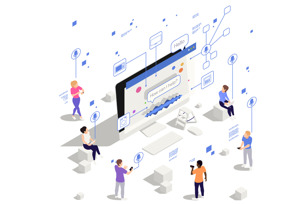
Enhancing your brand experience for the targeted audience is one of the best ways to entice users. Build short, crisp, and innovative content using creative animation, graphics, and great designs. Your animation designs are more recognized by performing micro-animations. As you have seen in the Google logo, they use dots for the speech recognition tools. It will showcase communication different statutes including waiting, listening, processing, and answering.
Putting It All Together
Micro-interactions should be the must-have element to deliver the modern user experience to your targeted audience. It’s something that you should pay more attention to when building a webapp. The well-designed micro-interactions provide users with seamless communication and help eliminate errors.
Moreover, it will enrich your newly developed product or app by serving as a communicating brand. Hence, it encourages your audience to prioritize your product over your competitors.
You can simply say a lot without using a single word with micro-interactions. And Yes, it turns out to be a successful software investment.


